Color saturation is one of the most essential aspects of design and visual communication. It refers to the intensity or purity of a color, determining how vivid or dull it appears. A saturated color is bright and rich, while a desaturated one appears more muted or grayish. Understanding how to saturate a color properly can help artists, designers, and photographers create more engaging visuals, emphasize emotions, and control the mood of an image. Whether you’re working in digital art, photography, graphic design, or traditional media, knowing how to adjust color saturation is a fundamental skill that enhances the overall impact of your work.
Understanding Color Saturation
Saturation is a key component in color theory, often discussed alongside hue and brightness (or value). It defines how pure or intense a color is. For example, a fully saturated red is bold and vibrant, while a less saturated red might look pinkish or even gray. In digital design, saturation adjustments can be done through image editing software, while in painting, it involves careful selection and mixing of pigments.
Why Saturation Matters in Design
Saturated colors attract attention and convey energy. They are often used to highlight focal points, express strong emotions, or create contrast. Desaturated colors, on the other hand, are useful for backgrounds, subtle designs, or to evoke calmness and nostalgia. Balancing saturated and desaturated tones can bring harmony and visual interest to your work.
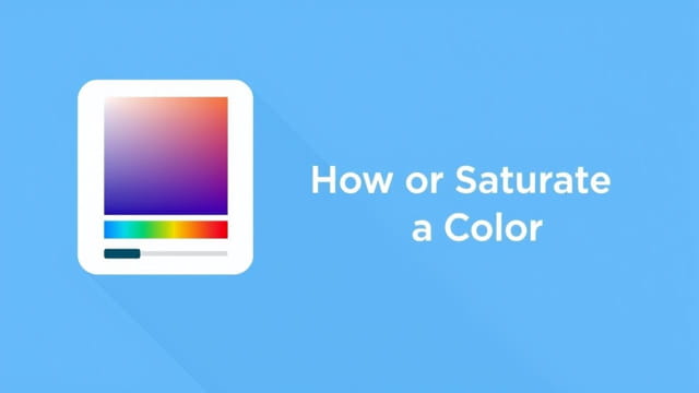
How to Saturate a Color in Digital Tools
Modern design software like Adobe Photoshop, Illustrator, and even mobile apps provide easy ways to control saturation. The method may vary depending on the tool, but the concept remains the same.
Using Adobe Photoshop
- Open your image or artwork in Photoshop.
- Go to the top menu and selectImage>Adjustments>Hue/Saturation.
- In the Hue/Saturation dialog box, move theSaturationslider to the right to increase saturation.
- Preview the result and click OK when you’re satisfied.
You can also apply a Saturation adjustment layer to make non-destructive changes. This allows you to modify or reverse the effect at any time without altering the original image.
In Adobe Illustrator
While Illustrator doesn’t have a traditional saturation slider like Photoshop, you can still increase color intensity by adjusting the color values or applying effects:
- Select the object or artwork.
- Go toEdit>Edit Colors>Adjust Color Balance.
- Use the sliders to emphasize specific color channels and enhance saturation.
- Alternatively, increase the RGB or CMYK values to make the color appear more intense.
Using Online Tools and Apps
There are many free online editors such as Pixlr, Fotor, and Canva that allow you to adjust color saturation easily:
- Upload your image to the editor.
- Find the Adjust or Filter panel.
- Increase the saturation slider to intensify the colors.
- Download the edited image when done.
Saturating a Color in Traditional Art
If you’re working with paints, pencils, or markers, saturating a color involves more than just adding more pigment. You need to understand how different color combinations affect intensity.
Choosing High-Chroma Pigments
To create a saturated color, start with pigments that naturally have a high chroma, such as cadmium red, phthalo blue, or hansa yellow. These are already vibrant and pure, making it easier to achieve saturated effects without extensive mixing.
Layering Techniques
In mediums like watercolor or colored pencils, layering can help build up intensity:
- Apply multiple layers of the same hue to enhance saturation.
- Let each layer dry before adding the next to avoid muddy results.
- Avoid adding white or complementary colors, which can desaturate the tone.
How to Control Saturation in Photography
In photography, saturation plays a major role in how the image feels. You can boost or reduce it during post-processing or even while capturing the photo.
Adjusting Saturation in Post-Processing
Most photo editing software includes tools for saturation control. In Lightroom, for example:
- Open your image in the Develop module.
- Use the Saturation or Vibrance sliders in the Basic panel.
- Saturation affects all colors equally, while Vibrance targets muted colors and avoids oversaturating skin tones.
Use caution to avoid oversaturation, which can make images look unnatural.
Using Camera Settings
Some cameras allow you to control saturation directly in the settings:
- Switch to a picture style or color profile with high saturation.
- Adjust in-camera saturation settings manually.
- Use filters such as polarizers to enhance natural color vibrancy in outdoor scenes.
Tips for Effective Color Saturation
Applying saturation effectively is about more than making colors brighter. Here are some best practices:
- Use saturated colors sparingly to draw attention to specific areas.
- Balance with neutral or desaturated tones to avoid visual overload.
- Match saturation levels with the mood you want to convey.
- Test your design in grayscale to check for contrast clarity.
- On screens, consider color calibration to see true saturation levels.
Common Mistakes to Avoid
While increasing saturation can improve a design or photo, going too far often leads to problems. Here are some mistakes to avoid:
- Oversaturation: This can make skin tones look unnatural and colors appear fluorescent.
- Inconsistent saturation: Applying different saturation levels without purpose can create imbalance.
- Ignoring context: Not all designs benefit from high saturation. Consider the message and audience.
- Clipping colors: In digital media, extreme saturation can lead to color clipping, where detail is lost.
Applications of Saturated Color
Saturation is a creative tool that plays a role in many design areas:
- Branding: Bold, saturated colors can create memorable brand identities.
- Advertising: High saturation grabs attention in posters, billboards, and social media.
- Web design: Colorful buttons and headers increase user engagement.
- Illustration: Saturated colors enhance storytelling and emotion.
Learning how to saturate a color is a key skill for anyone working in visual media. Whether you’re adjusting images in Photoshop, mixing paints, or enhancing photos in Lightroom, understanding how saturation works allows you to create more compelling and expressive visuals. By applying the right techniques and avoiding common pitfalls, you can use color saturation to lead the viewer’s eye, evoke emotion, and elevate your creative work. With practice and intention, mastering saturation will make your designs stand out with clarity and vibrancy.