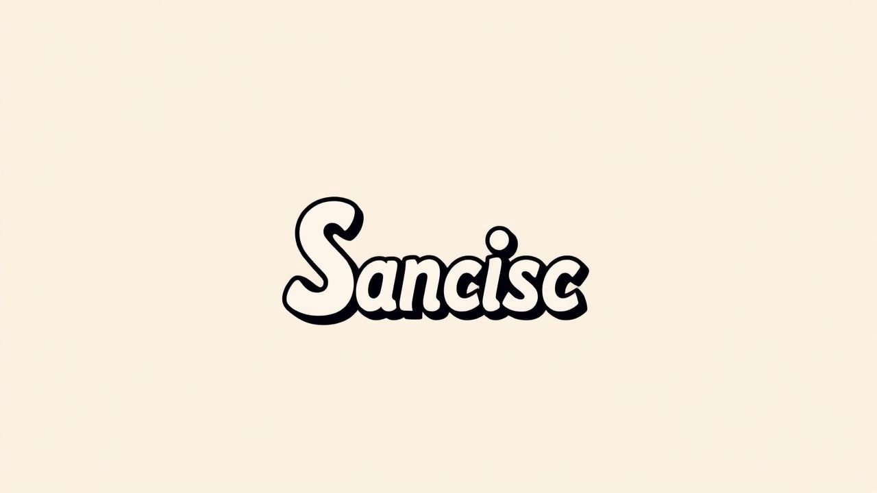
SF Slapstick Comic Font is a playful and energetic typeface that captures the essence of comic books, cartoons, and humorous print material. Known for its informal and exaggerated letter shapes, this font brings a sense of fun and lightheartedness to any design. Whether you’re creating a children’s book cover, a comic strip, or a poster for a comedy event, SF Slapstick Comic is the kind of font that instantly grabs attention and communicates amusement. Its distinctive appearance makes it a favorite among designers looking to inject personality and humor into their creative work.
Understanding the SF Slapstick Comic Font
SF Slapstick Comic is part of a broader family of fonts developed by ShyFonts. As the name suggests, it was designed with slapstick comedy in mind think of exaggerated movements, visual gags, and classic cartoon humor. The font embodies these themes through quirky letterforms, varied angles, and a hand-drawn look that avoids rigid structure.
Key Characteristics
- Informal, cartoonish style with bouncy letterforms
- Exaggerated shapes and angles for a comic book feel
- Suitable for display purposes, not intended for body text
- Works well with humorous, creative, and child-friendly content
Each character in SF Slapstick Comic appears as though it’s full of energy, with uneven baselines and expressive strokes that mimic handwriting. This quality makes it excellent for loud, fun, or silly designs.
Design Uses for SF Slapstick Comic Font
SF Slapstick Comic is primarily used in contexts that benefit from a humorous or entertaining tone. Its highly stylized appearance limits its utility for formal or professional projects, but it’s perfect when the goal is to entertain or engage through humor. Designers often use this font for visual storytelling or kid-centric products.
Common Applications
- Comic strips and graphic novels
- Children’s books and storyboards
- Party invitations and greeting cards
- Event posters for comedy shows or school plays
- Youth-oriented websites and digital banners
- Creative DIY and scrapbooking projects
Because of its exaggerated style, SF Slapstick Comic grabs attention instantly, making it useful for headings, speech bubbles, and anything that needs to shout with a smile.
Font Pairing Tips
When using SF Slapstick Comic in design, it’s essential to pair it with complementary fonts to maintain visual balance. Because it’s so expressive, pairing it with neutral, clean typefaces helps avoid a cluttered or chaotic layout.
Recommended Pairing Fonts
- Open Sans: A clean sans-serif font that adds readability and contrast to SF Slapstick Comic’s playful form.
- Roboto: Offers a modern and minimal counterpart, making the design feel balanced.
- Raleway: Provides a sleek and stylish complement that works well in digital designs.
- Arial or Helvetica: Simple fonts that allow SF Slapstick Comic to shine without visual conflict.
Using SF Slapstick Comic as a headline font, while reserving more neutral fonts for body text, creates hierarchy and enhances the viewer’s reading experience.
How to Use SF Slapstick Comic Effectively
While this font is naturally fun and appealing, using it strategically ensures that it doesn’t overpower your design. Here are a few guidelines to make the most of its qualities:
Tips for Designers
- Use sparingly: Due to its bold personality, limit SF Slapstick Comic to titles, logos, or emphasis text.
- Maintain contrast: Use simple background colors or flat designs to avoid clashing with the font’s lively style.
- Scale appropriately: The font works best at medium to large sizes where its quirky details are visible.
- Combine with themed visuals: Pair with cartoons, illustrations, or bright colors for a cohesive visual story.
Proper use of SF Slapstick Comic will enhance the user’s experience and keep the overall design engaging and fun, especially for younger audiences or casual projects.
Alternatives to SF Slapstick Comic
For designers looking for similar options, several other fonts offer the same comic-style energy and light-hearted tone. Exploring these alternatives can provide flexibility in design while maintaining the intended humor and playfulness.
Popular Alternatives
- Comic Sans MS: Possibly the most well-known casual comic font, though often criticized for overuse.
- Bangers: A bold comic-style typeface great for headlines and comic titles.
- Komika Axis: Features cartoonish lettering with wide appeal.
- Badaboom BB: A dynamic font often used in action comic speech bubbles.
- Toonish: Light and animated, ideal for projects involving children or animation.
These fonts offer alternatives that maintain a similar mood, allowing you to experiment while staying consistent with your design vision.
Where SF Slapstick Comic Stands Out
One of the main advantages of SF Slapstick Comic is its unique character. While many fonts attempt to mimic handwriting or cartoon lettering, few do it with the same level of expression and impact. Its hand-drawn aesthetic, irregular strokes, and whimsical attitude set it apart in the font world.
Unique Strengths
- Evokes emotion and movement in static designs
- Well-suited for energetic, informal communication
- Supports creative freedom in youth-focused projects
These traits make it an ideal option for situations where you want the text to feel like part of the artwork rather than just a message. SF Slapstick Comic becomes part of the storytelling itself.
SF Slapstick Comic Font is a bold and entertaining typeface that brings laughter, creativity, and playfulness into any project. It’s the perfect choice for anyone designing content aimed at children, families, or casual audiences who enjoy comic-style graphics. Its exaggerated, energetic shapes make it stand out, while its hand-drawn nature adds authenticity and warmth. When paired wisely and used in the right context, SF Slapstick Comic can elevate designs from ordinary to unforgettable. Whether you’re creating a comic panel, a party flyer, or a light-hearted social media post, this font ensures your message gets noticed and remembered with a smile.
