Data visualization is a crucial part of understanding information quickly and effectively. Among the many tools available for presenting data, bar graphs are one of the most commonly used because of their simplicity and clarity. A segmented bar graph is a specific type of bar chart that allows viewers to see not only the total value of a category but also how that total is divided into smaller subcategories. This type of graph is highly effective for comparing multiple groups while simultaneously showing the composition of each group, making it a versatile and informative tool in fields ranging from business analytics to education and research.
Definition of a Segmented Bar Graph
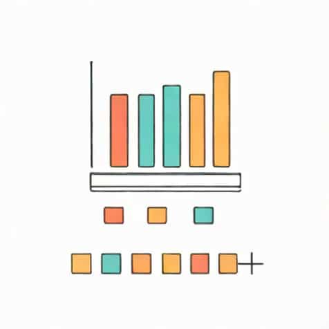
A segmented bar graph, sometimes referred to as a stacked bar chart, is a visual representation of data in which individual bars are divided into segments to display subcategories within the main category. Each bar represents a total value, and the segments within the bar show how that total is distributed among different components. This allows viewers to see both the overall size of the category and the relative proportions of each subcategory at the same time.
Key Features of Segmented Bar Graphs
Segmented bar graphs have several distinguishing features that set them apart from standard bar charts
- Division of BarsEach bar is divided into segments that represent subcategories or parts of the whole.
- Color CodingSegments are often color-coded to differentiate the subcategories, making the graph easier to read.
- Total Value RepresentationThe entire length of the bar corresponds to the total value of the category, while individual segments reflect the size of each subcategory.
- Comparison Across CategoriesMultiple segmented bars can be placed side by side to compare both totals and proportions across different categories.
Uses of Segmented Bar Graphs
Segmented bar graphs are widely used in various contexts because they efficiently communicate complex data. They are particularly useful when it is important to compare both the total values and the internal composition of different groups. Some common applications include
Business and Marketing
In business, segmented bar graphs are often used to show sales data, market share, or revenue breakdowns. For example, a company might use a segmented bar graph to display total monthly sales, with segments representing sales from different product lines. This visualization helps managers quickly see which products contribute most to revenue and identify trends over time.
Education
Educators and researchers use segmented bar graphs to display survey results, student performance, or demographic information. For instance, a school might chart the total number of students in each grade, with segments indicating the number of students achieving different grade levels. This allows for easy identification of patterns and areas needing attention.
Healthcare and Social Sciences
Segmented bar graphs are also common in healthcare and social research. Researchers might visualize patient data, such as the total number of patients with a particular condition, segmented by age group, gender, or treatment type. This helps healthcare professionals understand the distribution of cases and plan interventions accordingly.
Advantages of Segmented Bar Graphs
Segmented bar graphs offer several advantages over other types of charts and graphs
- Clear Visual ComparisonThey allow viewers to compare total values and subcategory proportions simultaneously.
- Efficient Use of SpaceBy stacking subcategories within a single bar, segmented bar graphs reduce clutter compared to multiple separate bars.
- Highlighting RelationshipsThey emphasize how different components contribute to the whole, making relationships between subcategories easier to understand.
- Easy InterpretationColor coding and segmentation make it simple to identify key trends and patterns quickly.
Limitations
While segmented bar graphs are very useful, they do have some limitations. If there are too many subcategories, the graph can become confusing or difficult to read. Small segments might be hard to distinguish, and colors may overlap visually, reducing clarity. In cases where exact numerical comparison of subcategories is required, other types of charts, such as grouped bar graphs or pie charts, might be more appropriate.
How to Create a Segmented Bar Graph
Creating a segmented bar graph involves several key steps, which can be applied using spreadsheet software or data visualization tools
Step 1 Collect and Organize Data
Start by collecting data for the main categories and their subcategories. Organize the data in a table, ensuring each category has a total value and each subcategory has a corresponding portion of that total.
Step 2 Choose the Graph Type
Select a segmented or stacked bar graph option in your software. Ensure that the tool allows you to display subcategories within each bar.
Step 3 Enter Data and Assign Colors
Input the data for each category and subcategory. Assign different colors or shading to each subcategory for easy visual distinction.
Step 4 Label Axes and Segments
Label the x-axis (or y-axis for horizontal bars) with the categories and the other axis with the numerical values. Add a legend to indicate what each color or segment represents.
Step 5 Review and Adjust
Check the graph for readability and accuracy. Adjust colors, segment sizes, or labels if necessary to ensure the visualization communicates the data clearly.
Tips for Effective Segmented Bar Graphs
- Use contrasting colors for different segments to enhance readability.
- Limit the number of subcategories to avoid clutter.
- Ensure consistent ordering of subcategories across all bars for easier comparison.
- Include clear labels and legends to explain the meaning of each segment.
- Consider using horizontal bars if category names are long or if there are many categories.
Examples in Real Life
Segmented bar graphs are widely used in reports, presentations, and dashboards. Examples include
- Displaying company revenue with segments for different products or regions.
- Showing population distribution by age, gender, and region.
- Visualizing budget allocation for different departments within an organization.
- Representing survey results with responses divided by demographic groups.
A segmented bar graph is a powerful tool for data visualization, allowing viewers to see both the total values of categories and the breakdown of their components. Its applications are diverse, ranging from business and education to healthcare and social research. By carefully organizing data, using color coding, and labeling segments clearly, a segmented bar graph can effectively communicate complex information in a visually intuitive way. Understanding how to interpret and create segmented bar graphs enhances one’s ability to make data-driven decisions, identify trends, and convey meaningful insights in a clear and concise manner.